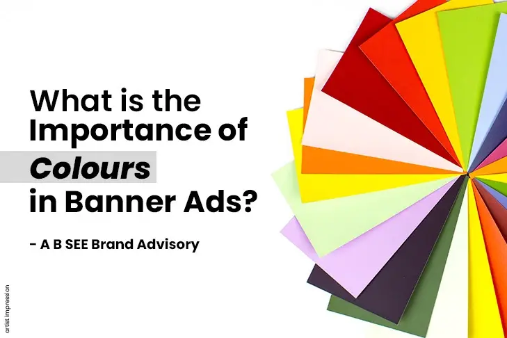
What is the Importance of Colors in Banner Ads?
In the world of digital advertising, colors in banner ads play a vital role in capturing users’ attention and driving engagement. With the ever-increasing competition for online visibility, it is crucial to understand and leverage every aspect that can enhance the effectiveness of these ads.
One such critical factor is the use of colours, which is very prevalent in many of the best advertising agencies in Mumbai. The strategic selection and implementation of colours in banner ads can significantly impact their success by the creative agency in Mumbai
In this blog post, we will delve into the importance of colours in banner ads and explore how they can influence consumer perception, evoke emotions, and ultimately drive desired actions.
Essential Knowledge of Colours That Everyone Should Know
Understanding the basics of colour is essential for various fields, including art, design, and even everyday life. Here are some fundamental concepts about colour that everyone should know:
Primary Colours
Primary colours are a set of colours that cannot be created by mixing other colours. These colours form the foundation for all other colours in the colour wheel. In traditional colour theory, there are three primary colours:
- Red
- Blue
- Yellow
By mixing primary colours, you can create a wide range of other colours.
Secondary Colours
Secondary colours are created by mixing equal parts of two primary colours. In traditional colour theory, there are three secondary colours:
- Orange
- Green
- Purple
Tertiary Colours
Tertiary colours are created by mixing a primary colour with a secondary colour. There are six tertiary colours in traditional colour theory. They are named by combining the names of the primary and secondary colours used to create them. For example:
- Red-orange
- Yellow-orange
- Yellow-green
- Blue-green
- Blue-violet
- Red-violet
Tertiary colours provide more nuanced variations and allow for a broader spectrum of colours.
Understanding primary, secondary, and tertiary colours is a crucial step in exploring colour theory and applying it to various artistic, design, or practical endeavours.
If you are looking for the best banner ads, then you must approach the best advertising agency in Mumbai.
What are pure colours?
Pure colours, also known as hues, are the basic building blocks of the colour spectrum. They are colours that are not mixed with any other colours and are considered to be the most saturated and intense versions of a particular colour.
The primary colours—red, blue, and yellow—are often considered pure colours because they cannot be created by mixing other colours.
Tints
Tints are created when pure colours are mixed with white. Adding white to pure colour results in a lighter and less saturated version of that colour. Tints are often described as pastel or light colours and have a softer, more delicate appearance compared to their pure counterparts.
Shades
Shades, on the other hand, are created when pure colours are mixed with black. Adding black to a pure colour darkens it, resulting in a deeper and more subdued version of the original colour.
Both tints and shades are derived from pure colours, but the addition of white or black alters their properties, creating different visual effects and emotional responses.
Different Types of Colour Composition
Colour composition refers to the arrangement and combination of colours in a design or artwork. There are several types of colour composition techniques that artists and designers use to create visually pleasing and harmonious colour schemes. Here are four common types of colour compositions:
First: Analogous Colour Composition
Analogous colour composition involves selecting colours that are adjacent to each other on the colour wheel. These colours share similar undertones and create a harmonious and unified effect.
Second: Monochromatic Colour Composition
Monochromatic colour composition involves using different shades, tints, and tones of a single colour. This technique creates a unified and harmonious look while relying on variations of one hue.
Third: Complementary Colour Composition
Complementary colour composition involves selecting colours that are opposite each other on the colour wheel. These pairs of colours create a strong visual contrast and tend to enhance each other when used together.
Fourth: Triadic Colour Composition
Triadic colour composition involves using three colours that are evenly spaced around the colour wheel. These colours create a visually dynamic and energetic effect.
How do you choose the perfect colors in banner ads?
While choosing colors in banner ads, it’s essential to consider the following basic factors:
- Understand your target audience.
- Reflect on your brand identity
- Consider the ad’s purpose.
- Use colour psychology.
- Test and iterate.
Apart from this, you must consider the following aspects when selecting colors in banner ads:
Choosing colors in banner ads by gender
Assigning specific colours to genders is a social and cultural construct that can vary across different societies and periods. While there may be certain colour associations that are prevalent in some cultures or marketing strategies, it’s important to recognise that these associations are not universal or fixed.
In contemporary marketing, the idea of using colours exclusively based on gender is increasingly challenged. As per the Best Advertising Agency in Mumbai, many brands are moving away from gender stereotypes and embracing more inclusive approaches to colour selection. Instead of focusing solely on gender, it is often more effective to consider the preferences, values, and characteristics of the specific target audience you are trying to reach.
For example, if you are targeting specific genders in branding agency in mumbai, consider the cultural context.
Research suggests women may prefer softer colours, while men may be drawn to bolder shades. Remember to choose colours sensitively and inclusively.
Choosing colors in banner ads by age group
When considering colour preferences by age group, it’s important to note that individual preferences can still vary widely. However, there are some general trends and associations that can be considered:
- Children: Bright and vibrant colours tend to be appealing to young children.
- Teenagers and young adults: Bold and trendy colours often resonate with teenagers and young adults.
- Adults: Colour preferences can become more diverse and subjective among adults.
- Older adults: Softer colours and higher contrasts can be beneficial for this age group.
Remember, these age group preferences are generalisations, and individual preferences can vary significantly.
Choosing colour contrast in colors in banner ads
Colour contrast plays a crucial role in the design, especially in banner ads, where readability and visibility are essential. Here are some considerations for achieving effective colour contrast:
- Text and background
- Aesthetic appeal
- Test on different devices.
Here are a few examples of high-contrast colour combinations that work well for colors in banner ads:
- Black and white
- Red and blue
- Yellow and green
By paying attention to colour contrast, you can enhance the readability, visual hierarchy, and overall effectiveness of your banner ad.
Status of Banner Ads in 2023
Banner ads are still one of the most popular forms of online advertising, and they continue to be effective in reaching a large audience. In 2023, global digital banner advertising spending is expected to reach $69.59 billion, up from $66.53 billion in 2022.
This growth is being driven by the increasing popularity of mobile devices as well as the growing sophistication of banner ad targeting technologies. For branding agency in mumbai, colors in banner ads offer an excellent opportunity to showcase available properties, attract potential buyers, and create brand awareness.
Here are a few tips for creating effective banner ads:
- Keep your ads simple and easy to read.
- Use relevant and interesting content.
- Target your ads to the right audience.
- Use a call to action.
If you follow these tips, you can create colors in banner ads that are more likely to be seen, remembered, and clicked on.


Leave a Reply